US-Sport
MLB: Milwaukee Brewers change their Franchise logo
Published on
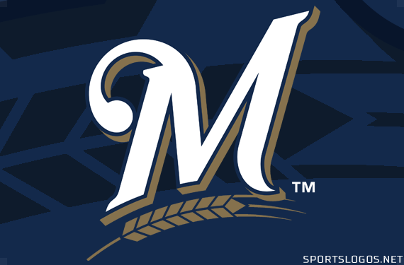
The Milwaukee Brewers have changed their logo after 18 years. Instead of the whole name of the franchise, there is now only one big “M” in the emblem of the team from the NL Central Division.
For the coming season, the Brewers will use a design with a wheat that has already been seen on the baseball caps of players and officials in the past.
The players’ uniforms are not affected by the logo, however, as this logo has already been used on the outfits in past seasons.
The Brewers join the Miami Marlins and the Colorado Rockies, who changed their logo a year ago. Recently, the Tigers (2016), Padres (2015), Pirates (2014) and the Indians (2014) also changed their emblem.
This article was published without prior view of the MLB.
Continue Reading
You may also like...
Related Topics:

Click to comment


You must be logged in to post a comment Login