US-Sport
MLB: Miami introduces new look
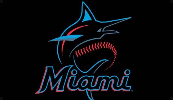
The Miami Marlins are continuing their far-reaching changes. Having already removed their home run sculpture from Marlins Park, they now presented a new logo and new team colours.
On Thursday evening the Marlins presented their new look at an event with a red carpet. Orange is no longer orange, but the team is now using blue, black, red and grey as a new colour combination.
As far as the new logo is concerned, a marlin can be seen here again, accompanied by baseball seams. Both are enthroned above a stylized Miami lettering.
The Marlins explained the choice of colours with the multitude of cultural flags that can be found in South Florida. The font is based on the typography normally found in Latin American culture. The font will also be reminiscent of the Miami Marlins Minor League team from the 1950s and the Havana Sugar Kings from the same period.
CEO Derek Jeter commented on the new look: “We have tried to capture the energy and diversity of Miami. We listened to our fans. We took a long time to look around Miami. We’re betting on Miami’s colors.”
The new colours as well as the logo are in contrast to the current one of the previous owner Jeffrey Loria. The previous look was introduced in 2012 for the opening of the Marlins Park.
“We want to put our own stamp on this organization,” Jeter said about the changes. “It distinguishes the past from the present and the future. It was important for us to do this.”
The team will also be presenting new jerseys shortly.
This article was published without prior review by Major League Baseball.


You must be logged in to post a comment Login